Subscape
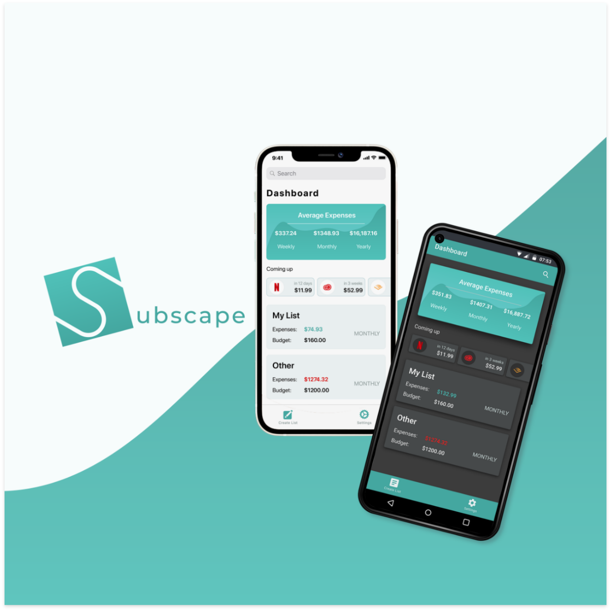
Subscription management app for iOS and Android to keep track of recurring expenses.
The Objective
To solve the problem of efficiently managing and keeping track of subscriptions and recurring expenses.
This project focused on following and implementing iOS Human Interface and Android Material Design guidelines.
Early Stages
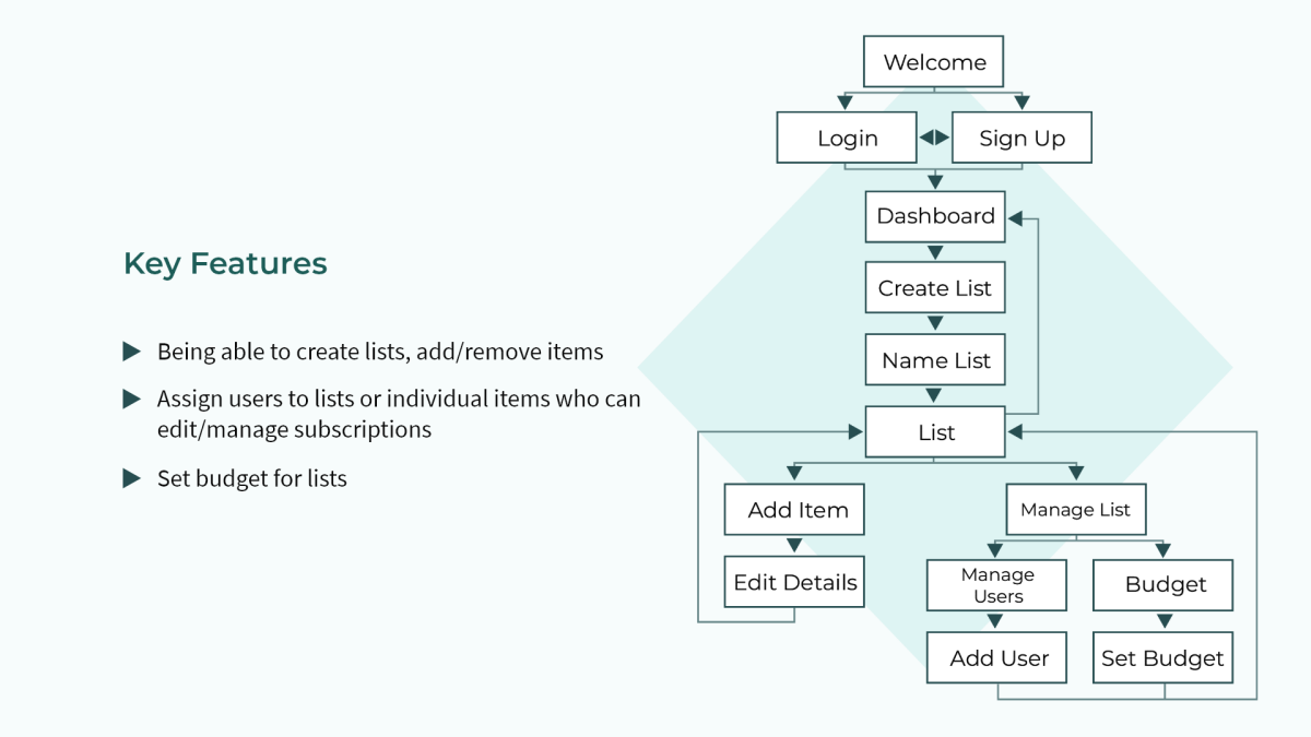
After defining the objective, context, and the target user base, I immediately started working on mapping out the key features necessary for an MVP.
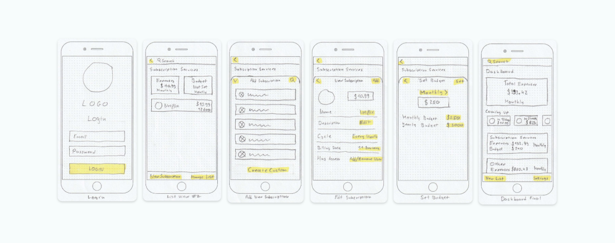
I then moved on to the sketching phase to figure out a general layout that's viable on both platforms.
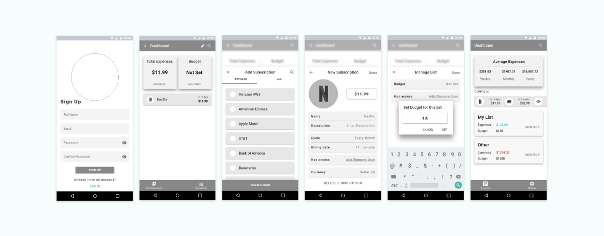
Once I had the basic layout down, I created mid fidelity wireframes. First for iOS,
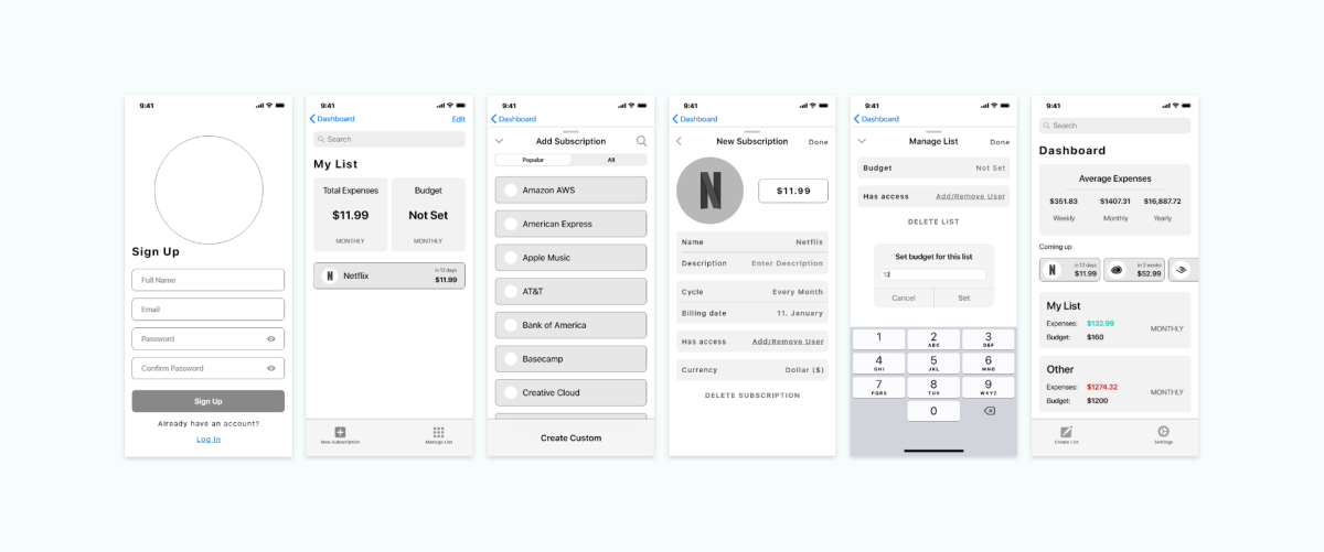
and then for Android.
Enhancing User Experience
An important step was to think of all the possible gestures the app would need to support in order to make the user experience simple and fluid.
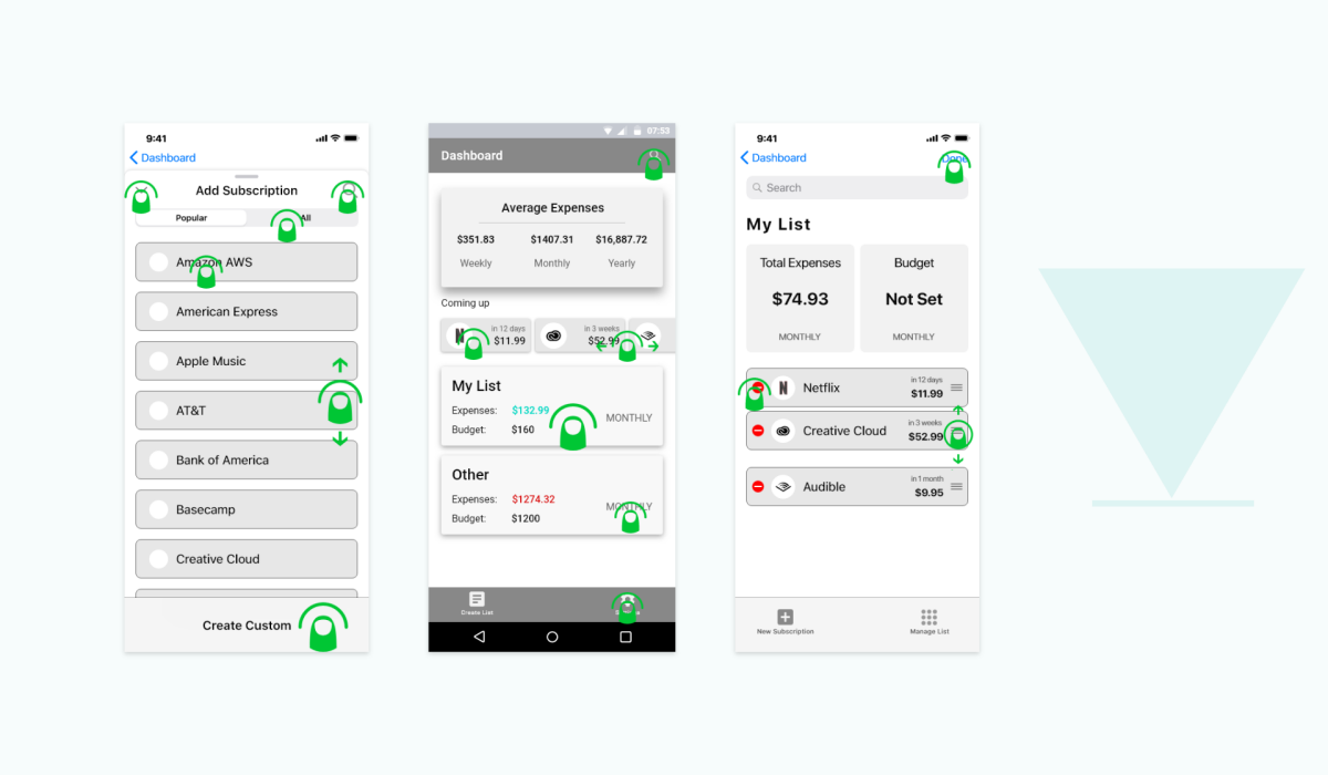
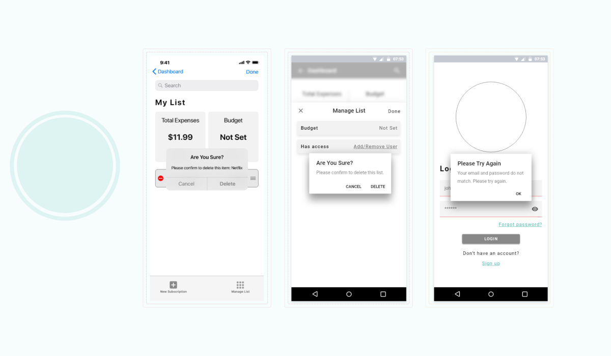
Similarly, I also thought about how the use of haptic feedback in certain scenarios could further enhance the intuitiveness of the app.
Visual Direction
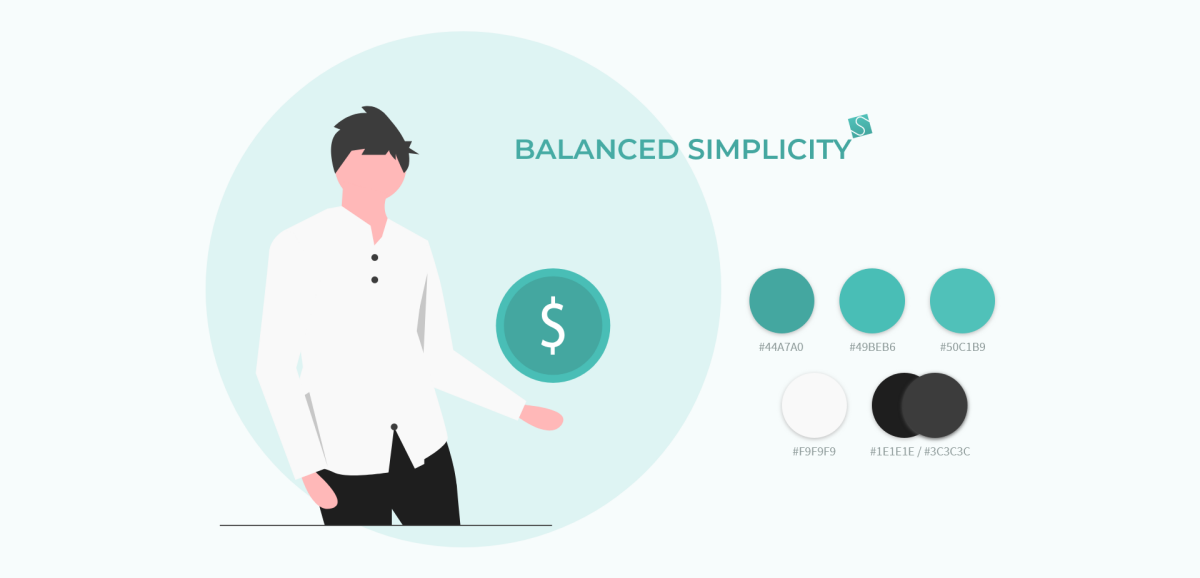
Visually speaking, my focus was to communicate a calm and reflective mood, as well as balance; qualities that are especially important when it comes to managing finances.
Prototyping
Once all the building blocks fell into place, I moved on to creating high fidelity prototypes for both iOS and Android. With the feedback I received during the testing phase, I was able to implement changes and fixes that brought me one step closer to the final design.
Interactive PrototypesFinal Design
With all the feedback and steps taken to figure out the nuances, the final screens for iOS were complete. For accessibility and OLED screen longevity reasons, I also focused on creating a dark mode version.
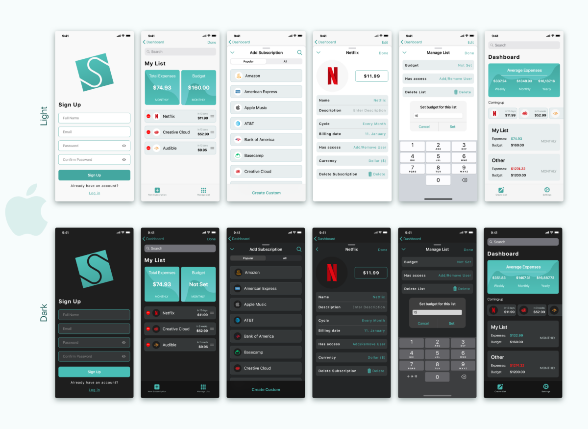
Same on Android.
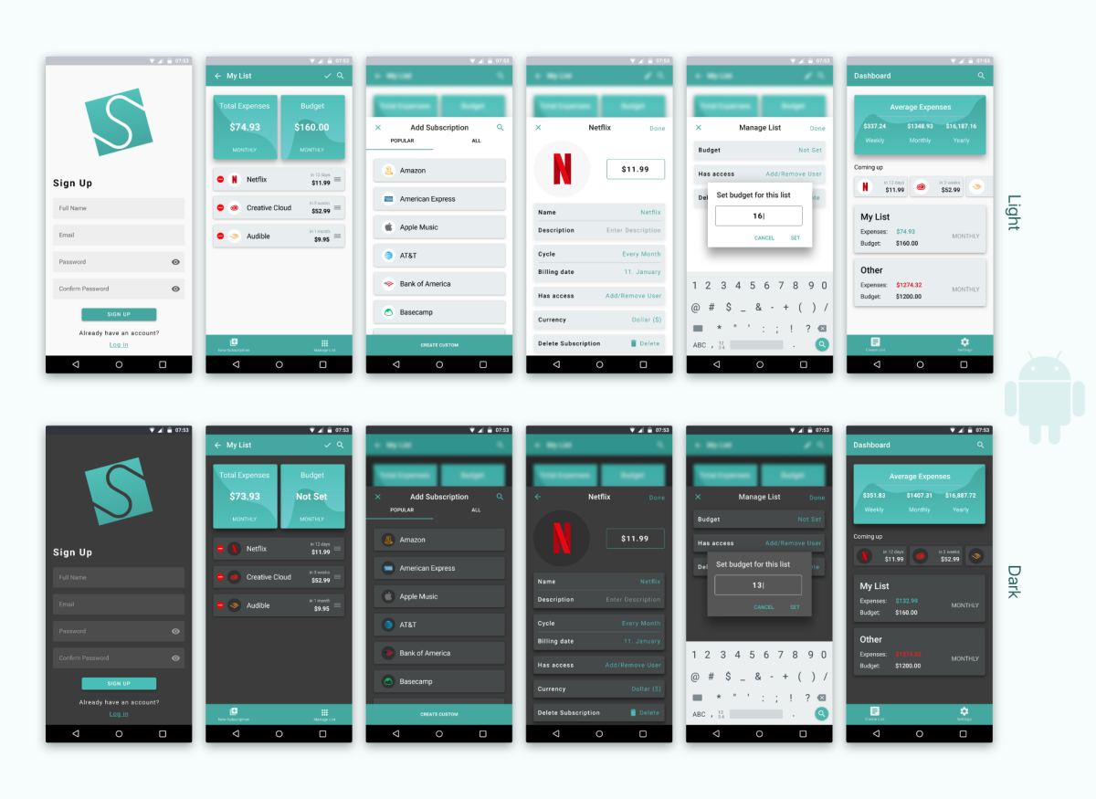
In Conclusion
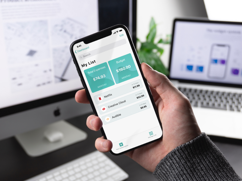
Working on two different platforms was a bit challenging. As I lack extensive personal experience with Android, I was not sure how much flexibility I had when it came to following Material UI Guidelines.
Prototyping and testing the final design was by far my favorite part of the project. Experimenting in XD with different animations and transitions to bring Subscape alive was a great experience, as well as testing it on actual users to see how they approach using Subscape.
I have no concrete plans for adding any major features to the app. Subscape was meant to be simple and focused on doing one thing well: efficiently managing subscriptions and recurring expenses that can easily get out of hand. I'd rather focus on polishing the existing features and implementing dark mode - which has yet to be prototyped and tested on potential users.
See the project on Behance